Orders Ship In 24 HOURS!* Learn More
Ace Tips: Pantones & Color Matching
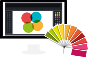
Color plays a huge role in how your brand is seen, but it is not always as simple as picking a shade on your screen and expecting it to look the same in print. Computer monitors use light to display color, while printers use ink, which means the same design can look different once it is produced.
That is why understanding Pantones and color matching is so important. With the right tools, you can take the guesswork out of printing and feel confident that your brand colors will show up the way you want them to.
Understanding Color

Meeting Expectations

Color in Printing: The Arrow vs. The Target

The Role of Pantone Color Matching

The Pantone Matching System (PMS)

Pantone Reference Book: Your Color Library

Getting color right in print is all about control. Without a clear target, your design is left up to the natural variations of printers, inks, and materials. By choosing Pantones and using tools like the Pantone Bridge book, you set a clear standard that helps your final product match your expectations. While no system is perfect, Pantone matching is the most reliable way to keep your brand colors consistent and professional every time you print.
As always, if you have any questions, we're here to help.
Contact our displays experts if you have any questions!
About Ace Displays
Our Mission
Our mission is to provide the best event & trade show displays at budget-friendly prices with unparalleled service to ensure we exceed our clients expectations and to foster an environment our employees are proud to work in.
The Ace Method
We are excited to work with you - from meeting your budget to meeting your deadlines - we will help you create a display that looks great and asserts your presence. To aid in what can be a rather laborious process, Ace has developed a 6-step method to get you a display quickly and easily so you can focus your time on other areas of your business and upcoming events.